Start with a unified color palette
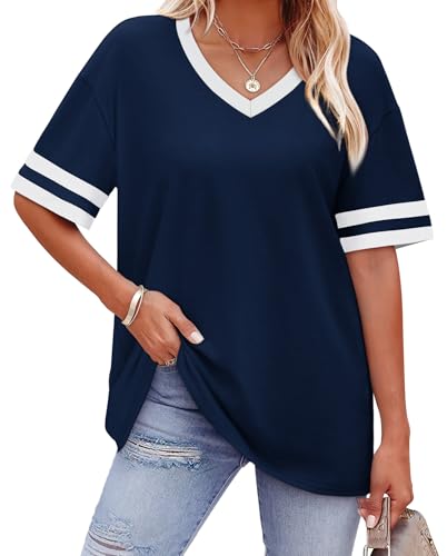
The easiest way to mix prints without clashing is to choose patterns that share at least one color. For example, pair a navy-and-white striped top with a floral skirt that has navy in its background. The common color ties the two prints together visually. If you are feeling bolder, try a monochromatic approach: mix a leopard print in beige with a pinstripe in the same beige tone. The eye reads the similarity in hue before noticing the contrast in patterns.
Vary the scale of your prints
Mixing two prints of the same size can feel chaotic. Instead, combine a large-scale print with a small one. A wide-striped sweater looks intentional with a tiny polka-dot scarf. Or wear a oversized floral blouse with a fine geometric-print skirt. The rule of thumb: one print should be dominant (larger) and one should be subordinate (smaller). This creates visual hierarchy and prevents a messy look.
Use a solid anchor piece
When in doubt, break up prints with a solid-colored item. A navy blazer over a striped dress with a floral handbag tones down the combo. A white t-shirt between a plaid jacket and leopard pants creates a breathing space. The solid piece acts as a visual pause, letting each print stand out without competing. Jeans, a black skirt, or a camel coat are excellent neutral anchors.
Stick to two prints max
For most occasions, wear no more than two distinct prints at once. Three starts to look costume-y. The exception is if one print is very subtle, like a pinstripe or a micro-check, which can act almost like a solid. For a safe start, try stripes with florals or polka dots with plaid. Both combinations are classic and forgiving.
Repeat a print in accessories
A smart trick is to echo a print from your clothing in an accessory. If your dress has a small gingham check, add a gingham headband or ballet flat. This repetition feels intentional and pulled-together. Or if your top is floral, carry a floral clutch. The key is that the repeated print does not have to match exactly; it just needs to be from the same family.
Embrace texture as a neutral
Texture can serve as a print mixer. A chunky cable-knit sweater with a silk leopard scarf looks harmonious because the textures differ. Similarly, a smooth satin blouse with a rough tweed skirt keeps prints interesting without clashing. Use matte vs. shiny or smooth vs. nubby to add depth without adding another pattern.
Bottom line
Mixing prints is about confidence and a few guiding rules. Start with a cohesive color palette, vary scale, and anchor with solids. Soon you will be layering stripes with florals like a pro.
Key Takeaway
Stick to two prints, a shared color, and different scales; use a solid anchor for balance.