Embrace Contrast, Avoid the Wash-Out: Colors to Navigate with Tan Skin
When styling for tan skin, the key is often contrast and vibrancy. Generally, you’ll want to avoid colors that are too similar to your skin tone, as they can make you look dull or washed out. This includes certain muted beiges, dull olive greens, and very pale, desaturated yellows. Instead, aim for shades that either pop against your skin or complement its warmth with depth and richness.
The Muted Suspects: When Neutrals Fall Flat
While neutrals are a wardrobe staple, not all of them play nicely with tan skin. Colors that closely mimic the undertones and saturation level of your tan can inadvertently erase your natural glow. Think about a sandy beige or a light, dusty taupe that lacks warmth or depth. If your skin has golden or olive undertones, a beige with similar cool, grayish undertones can sometimes make you appear sallow rather than luminous. Imagine trying on a matte linen dress in a light khaki or a muted oatmeal sweater. Instead of enhancing your tan, these shades might just blend in, leaving your complexion looking flat. The goal is for your clothing to frame and elevate your skin, not to disappear into it.
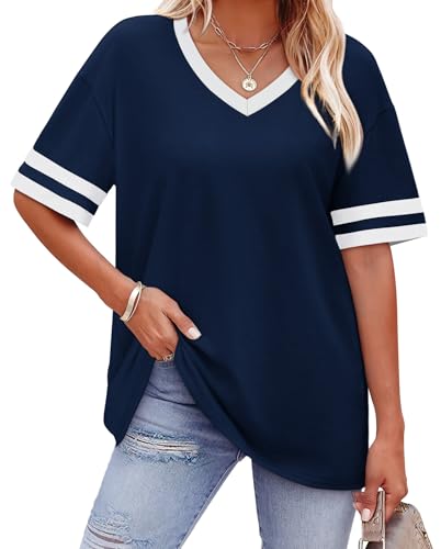
To combat this, if you love a neutral, opt for ones with clear distinction. A crisp, bright white is a fantastic choice, as is a deep, rich navy or a charcoal grey. If you lean towards beiges, look for those with a warmer, slightly deeper caramel or honey undertone, or ones that are distinctly lighter or darker than your skin tone. For example, a crisp cream or an ivory button-down provides a beautiful, clean contrast, making your tan truly stand out. Similarly, a rich chocolate brown offers a luxurious depth that complements warmer skin tones wonderfully, unlike a dull, mid-tone brown that might simply blend in.
The Pastel Predicament: Too Light to Shine?
Pastels can be tricky. While some vibrant pastels, like a clear sky blue or a soft coral, can look stunning on tan skin, very pale, desaturated pastels can often fall short. Picture a baby pink blouse that is almost white, a faded lavender dress, or a mint green that’s nearly translucent. These ultra-light shades often lack the punch and contrast needed to truly make tan skin pop. Instead of creating a fresh, bright look, they might just appear insipid, leaving your complexion without its usual vibrancy.
The trick with pastels is to ensure they still have enough saturation or brightness to stand out. If you adore pink, lean into a slightly deeper blush pink, a vibrant fuchsia, or a lively rose. For blues, consider a periwinkle or a clear robin’s egg blue rather than the palest powder blue. And for greens, a soft sage that leans slightly deeper or a light teal will offer more impact than a faded mint. Alternatively, if you wish to wear very pale pastels, consider pairing them with a more vibrant accessory, like a statement necklace in a contrasting jewel tone, or layering them with a darker jacket to create more visual interest and separation from your skin.
Earth Tones: Distinguishing Between Rich and Dull
Earth tones encompass a vast spectrum, and while many are fantastic for tan skin, it’s important to distinguish between rich, vibrant earth tones and their dull, desaturated counterparts. Rich terracottas, deep rusts, warm ochres, and vibrant forest greens can look absolutely magnificent, enhancing the warmth and depth of a tan complexion. These colors often share similar warm undertones, but their saturation ensures they stand out beautifully.
However, problems arise with earth tones that are too muted, dusty, or lack distinct warmth. An olive green that is too gray or brown, a desaturated mustard yellow, or a flat, uninspired khaki can have a similar washing-out effect as muted beiges. These colors, when they lack vibrancy, can make your skin appear tired or muddy. When selecting earth tones, always gravitate towards those that feel rich and alive, with clear color presence. A deep moss green, a vibrant burnt orange, or a sunny mustard yellow will serve your tan skin far better than their duller cousins. Fabric also plays a role here; a rich, textured knit in a vibrant earth tone will perform better than a thin, matte fabric in a similar, but less saturated, shade.
The Power of Intentional Contrast and Vibrant Hues
Ultimately, the guiding principle for choosing colors with tan skin is to create intentional contrast or complement with vibrancy. Colors that provide a clear distinction from your skin tone, whether they are brighter, darker, or have a significantly different hue, will always serve you best. Think about how stunning a vibrant cobalt blue, an emerald green, or a fiery coral looks against sun-kissed skin. Bright whites, true blacks, and bold primary colors are also fantastic choices that offer excellent contrast and make your tan pop.
Metallics like gold and bronze are particularly complementary, mirroring the warmth in your skin. Jewel tones such as sapphire, ruby, and amethyst create a luxurious, striking effect. Even brighter, more saturated pastels, as mentioned, can work wonderfully. The goal is to choose colors that look purposeful and deliberate, rather than those that blend into the background, allowing your beautiful tan to truly shine.
Key Takeaway
Prioritize vibrant colors and strong contrasts to illuminate your tan skin, and always test shades in natural light to ensure they enhance your glow.